5 Web Design Mistakes That Hurt SEO in 2019
Are you sure your web design has no mistakes? If your answer is NO, then you should check your Web Design Mistakes That Hurt SEO in 2019.
I am sure everyone can relate it. For the first time when we see our website live on the internet, we feel overwhelmed with the stunning look of it. But soon the joy starts vanishing when we don’t see any traffic coming.
Maybe the design of our website was not that healthy to convince the search engine that it is the better candidate to rank on the first page.
If you are an SEO expert like me then you might be knowing how important it is to consider SEO while designing the website.
But most people are not aware of the fact that SEO and web design are connected to each other. So they don’t consider essential parameters and often make web design mistakes that hurt SEO.
So in this post, I will walk you through the 5 biggest web design mistakes that are really bad for SEO of your website.
Many times you will be willing to remove H1 tag from the home page of your website to make it more appealing and beautiful in terms of design but If your home page lacks the H1 tag then you are missing the great opportunity to rank high for your focus keyword.
Search engine crawler on its visit to the page first crawls the H1 tag and if your focus keyword is present there then it will immediately get to know what your website is all about and it will be indexed for that keyword.
But if you don’t have an H1 tag then it has to crawl through your content to fetch your relativity to the focus keyword which ultimately results in poor ranking.
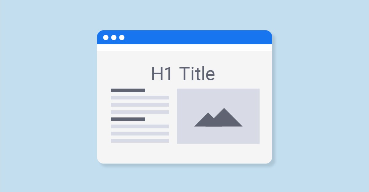
So always include H1 tag with your main keyword present in it which will be also helpful for visitors to get a quick knowledge about what your website is all about.
Including More Images and Less Text
Websites that use images only and very less text fail many times to communicate with their visitors. This is one of the biggest web design mistake as it leads to high Bounce rate and less interaction with the visitor.
I know how much important it is for a niche like Travel and Photography to include images on their web page but you should know that including more images to the page adds more loading time.
When you add huge HD images to your page you add a lot more size to it which as a result slows down the speed of your website and increases loading time which keeps many visitors away from your website.
Moreover, the site speed is one of the main ranking factors does Google itself does not like to keep its readers waiting. In order to display the best results on Page-1 search engine will never rank websites whose loading time is more than average.
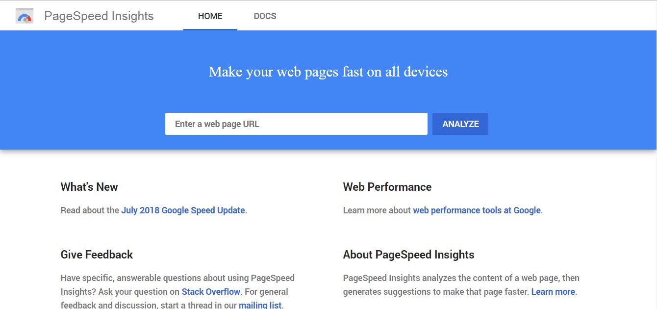
Use Google page speed insight test to check out the speed of your website and if it says your site needs improvement then its time to optimize all the images that are adding unwanted loading time to your site.
If you are a WordPress user you can use WP Smush plugin that compresses and optimizes the images you upload.
Improper 404 Page
An elegant 404 page with internal links is very important for user point of view and a crawler point of view.
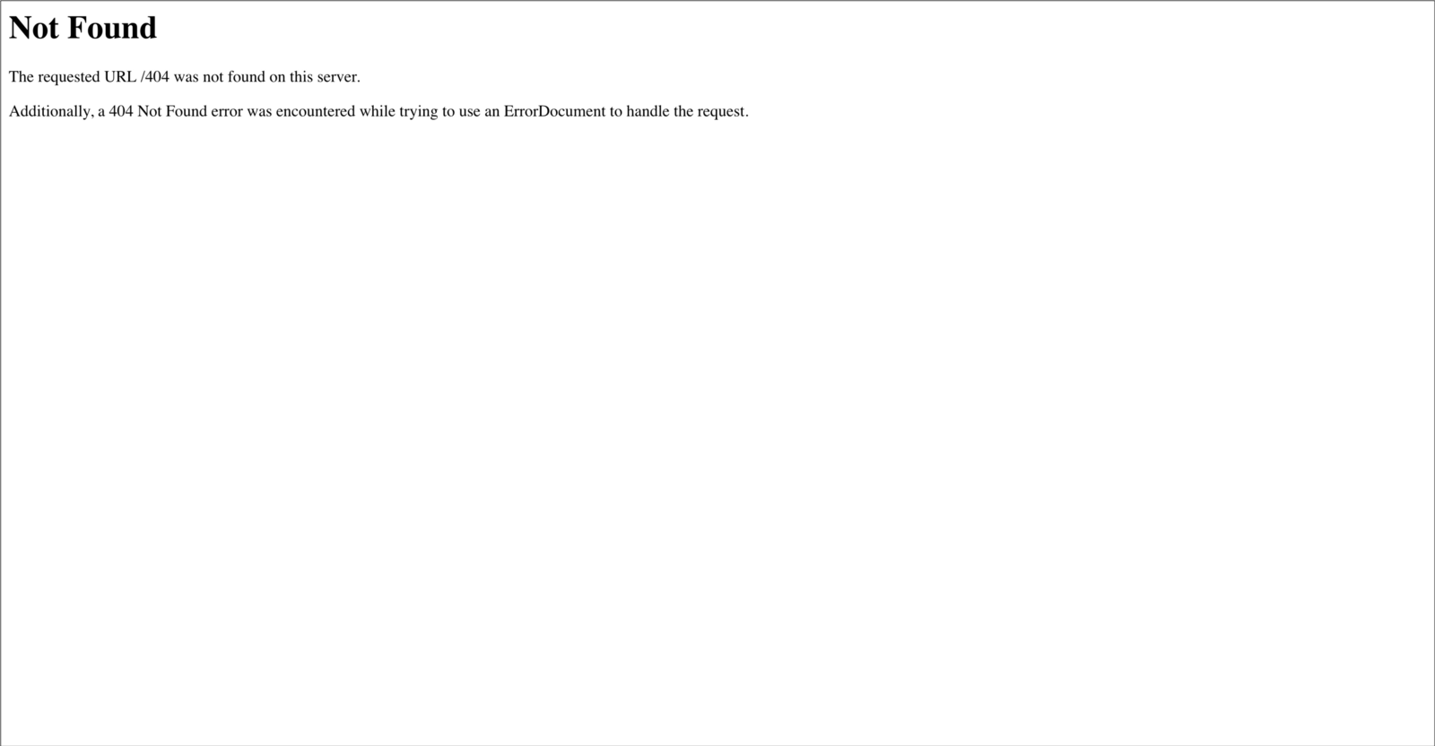
If someone lands on your 404 Page and it appears like this
As you can see there is no internal link present which means you are not pointing your visitor to any other page. The person will get confused and immediately exit your page which is bad for SEO of your website as it increases the bounce rate of it and also results in bad user experience.
But if your 404 page appears like this.
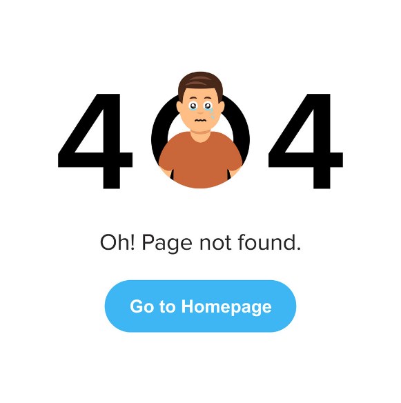
The person is more likely to click on Go to Homepage Button. You just saved him from regretting his visit.
Your 404 Page should have one internal link at least or a link back to the home page so that the crawler does not face a dead end if it crawls a broken link.
Pop Ups
Pop Ups are very good in terms of conversions and fetching an email of a visitor but at the same time, they can be really annoying for your readers. Pop ups work best when the user is leaving the site which is called exit intent pop up and it does not effect any user experience as the user was about to leave.
But what happens when you display pop up everywhere on your site?
The excessive use of Pop Ups in a site can hurt SEO as it gives a very bad user experience which is one of the ranking parameters on search engine.
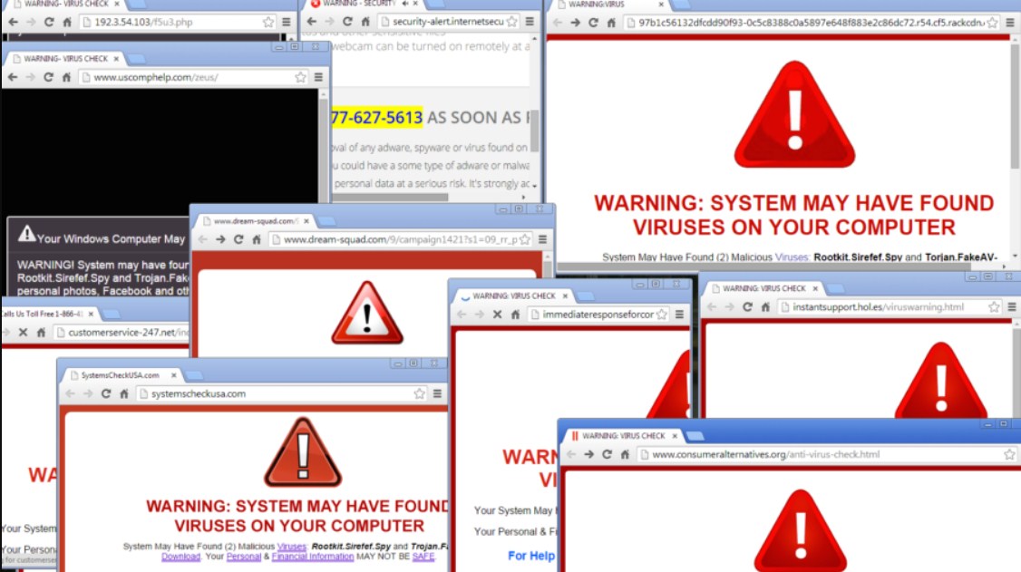
When Pop Ups appear, the interaction of a reader to your main content is interrupted which results in very bad user experience. So I will suggest you use a Pop up if and only if a visitor to your site has spent some time reading your content.
Using Text on Images
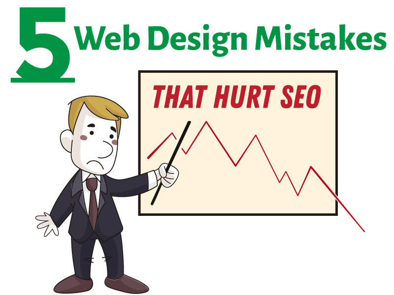
If you think the text ” Web design mistakes that hurt SEO” written on the above image can be read by search engine crawler then you are totally wrong as it can only read text, not images.
The text that appears on the images is not crawled by Google. That’s why we have Alt attribute which helps us to include our important text on the image to tell the crawler what this image is all about.
So always insert your complete image description inside the alt text to increase the relevancy of the image about the topic you are talking and improve your On page SEO score.
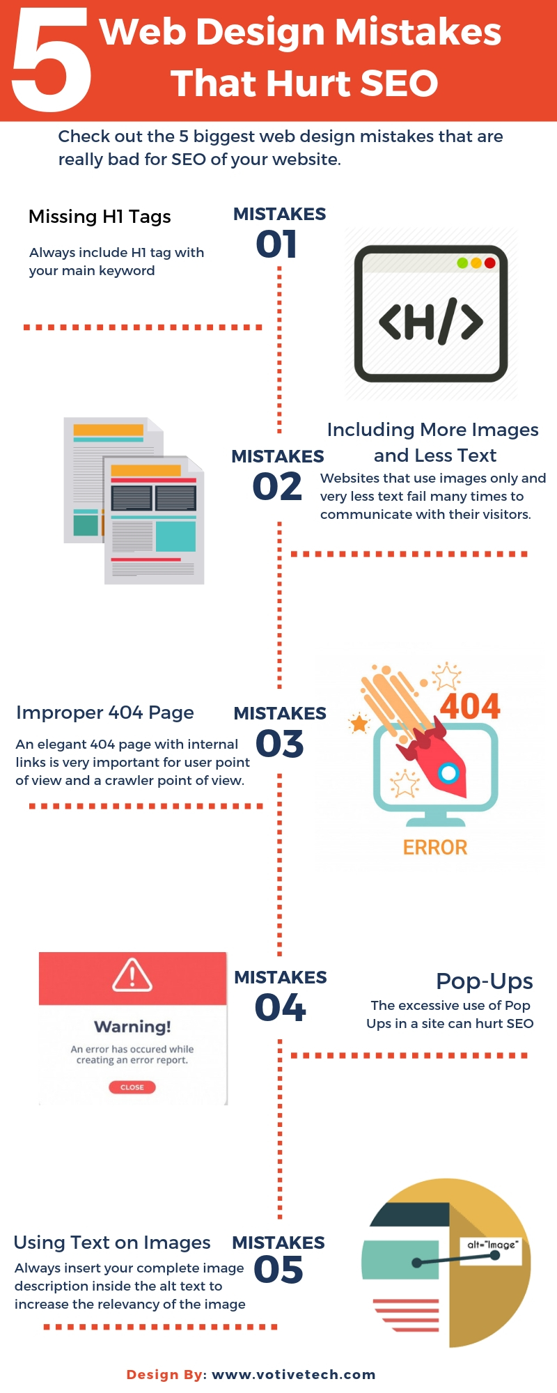
5 Web Design Mistakes That Hurt SEO Infographic
Conclusion: Most beautiful websites will never get upper hand over the optimized websites so it will be a big mistake to ignore the SEO parameters while building up a website.
If you have an agency working for you then ask their designers to interact with the SEO experts too so that they can hand over an optimized website to you.
For More Tips Click https://bit.ly/2iKAM8h or Contact 91 999 377 6088, votive.techs@gmail.com

 OTIVE TECHNOLOGIES